One of the safest ways to decorate a small space is to simplify everything – subtle patterns, light colors, limited decor, clean lines, etc. These techniques can indeed make a room appear larger and less cluttered, but guidelines like these might seem a little restrictive to all but the most dedicated minimalists. But there’s good news too!
The three homes outlined in this post definitely fall on the smaller side (ranging between 30 to 50 square meters) but their bold decor themes feel larger than life.
In fact, they break all those stodgy rules and end up even better for it.
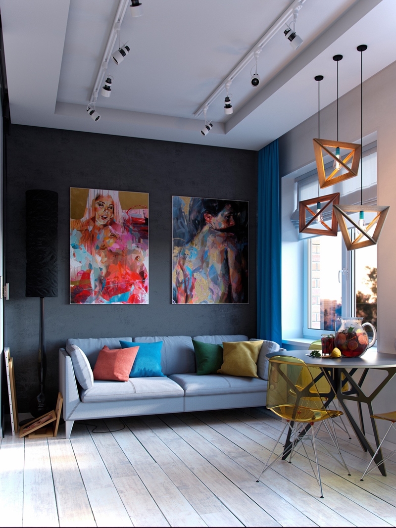
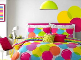
Let’s start with an extra compact interior. This apartment occupies only 30 square meters – but the designer didn’t let the compact floor plan limit creativity even one bit. The living room opens with a pair of portraits that immediately draw the eye, setting the stage for the vivid color palette and strong geometric themes used throughout the home.
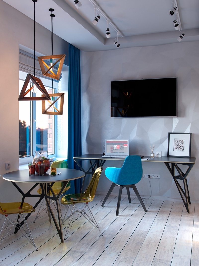 Despite the emphasis on color and texture, the white background really helps make this space work. The simple backdrop allows every creative element to stand out individually, rather than blending into a homogeneous theme.
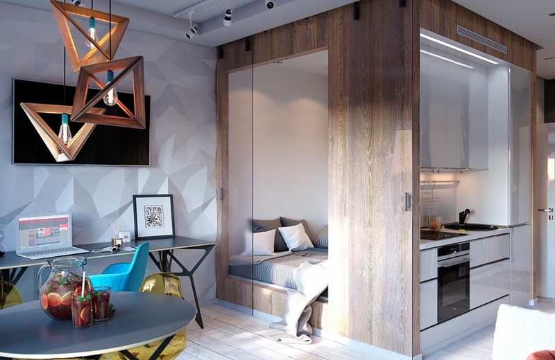 It’s also fun to point out some of the ingenious layout techniques that keep the interior feeling open and spacious. This independent volume houses the bedroom on one side and a compact kitchen on the other.
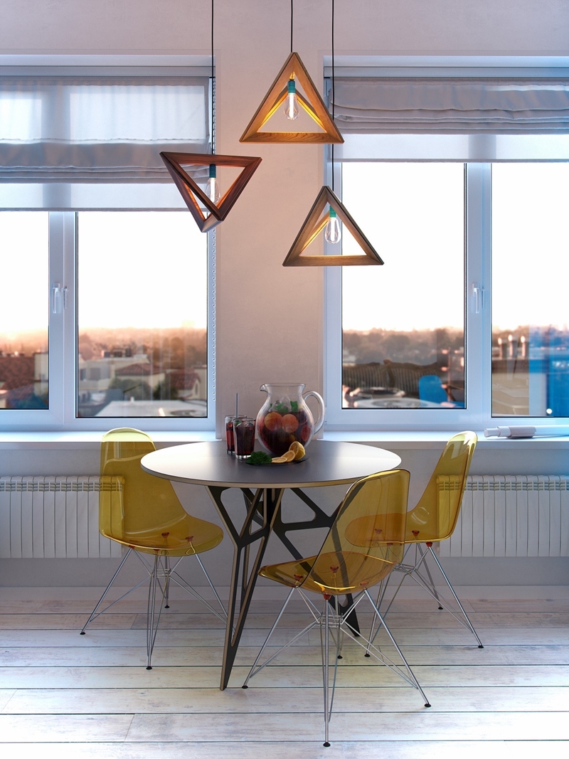 Smart composition makes a huge impression without the need to fill a space with “stuff”. Everything in this compact dining arrangement uses lightweight forms and materials but proves visually substantial.
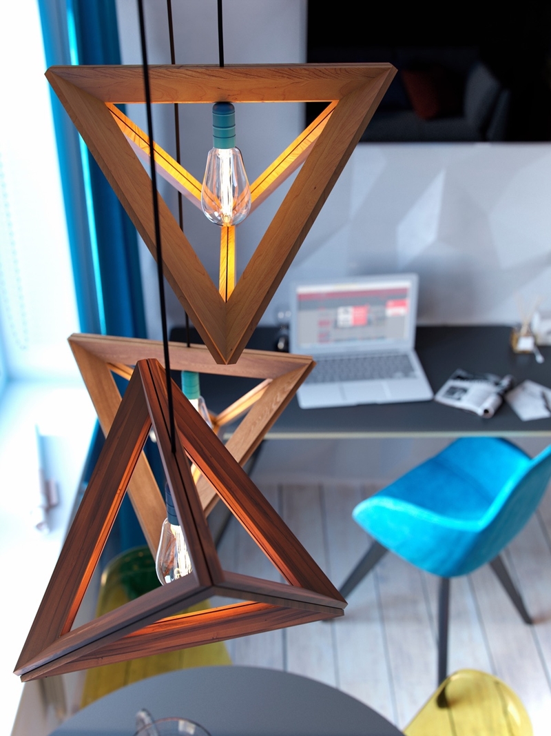 The pendants are from the Lampframe collection by Herr Mandel. Edison bulbs provide a soft diffused glow appropriate for a shadeless fixture like this one.
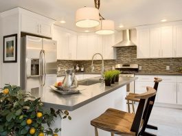
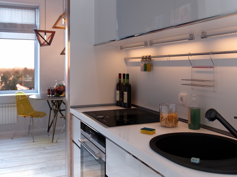 Smart storage solutions keep the kitchen looking tidy. A thin bar runs across the length and holds hanging spice shakers, a hanging storage rack, and could other accessories like hand towels or utensils too.
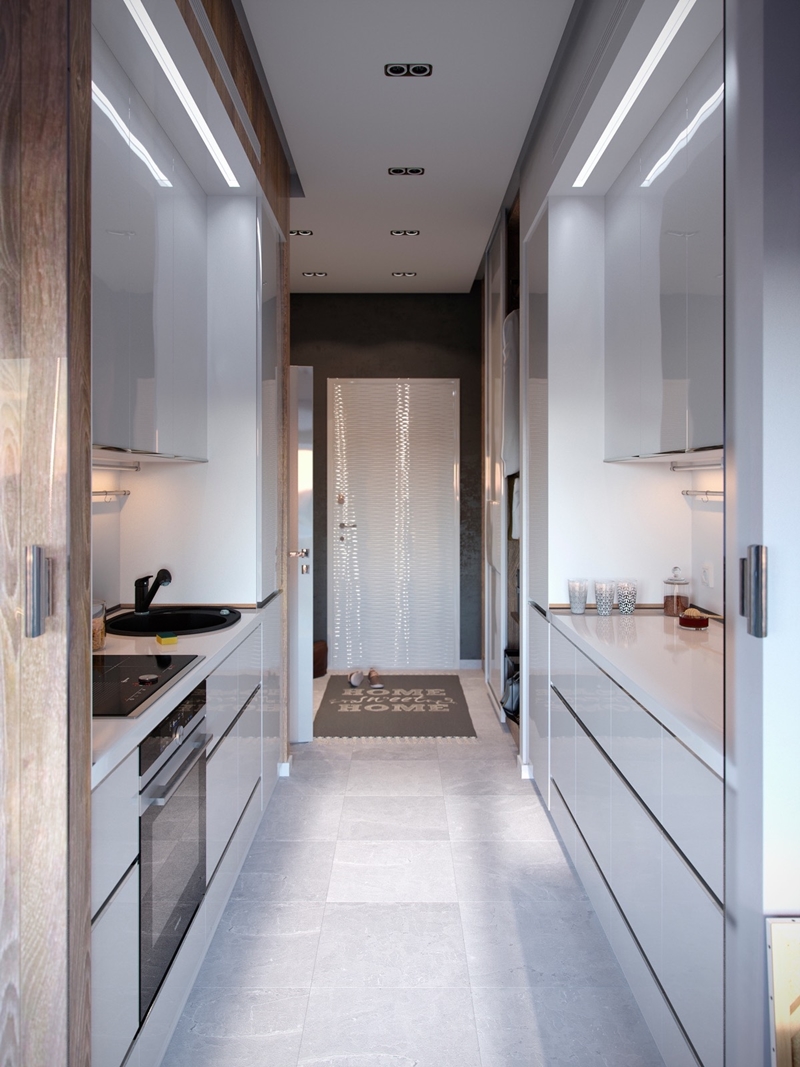 Galley kitchens without windows often run the risk of looking too dark. Here, glossy surfaces preserve what little sunlight the space does receive. Even the door joins in!
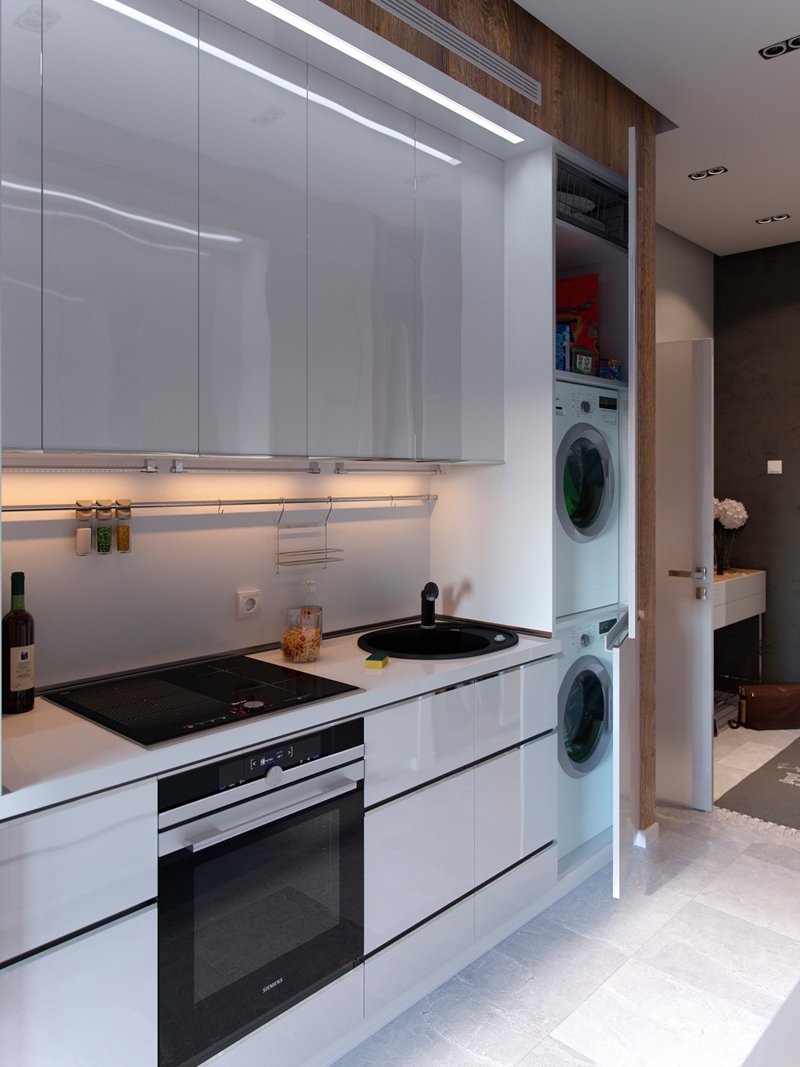 Laundry appliances hide behind an ordinary-looking cabinet door, blending right in with the rest of the kitchen.
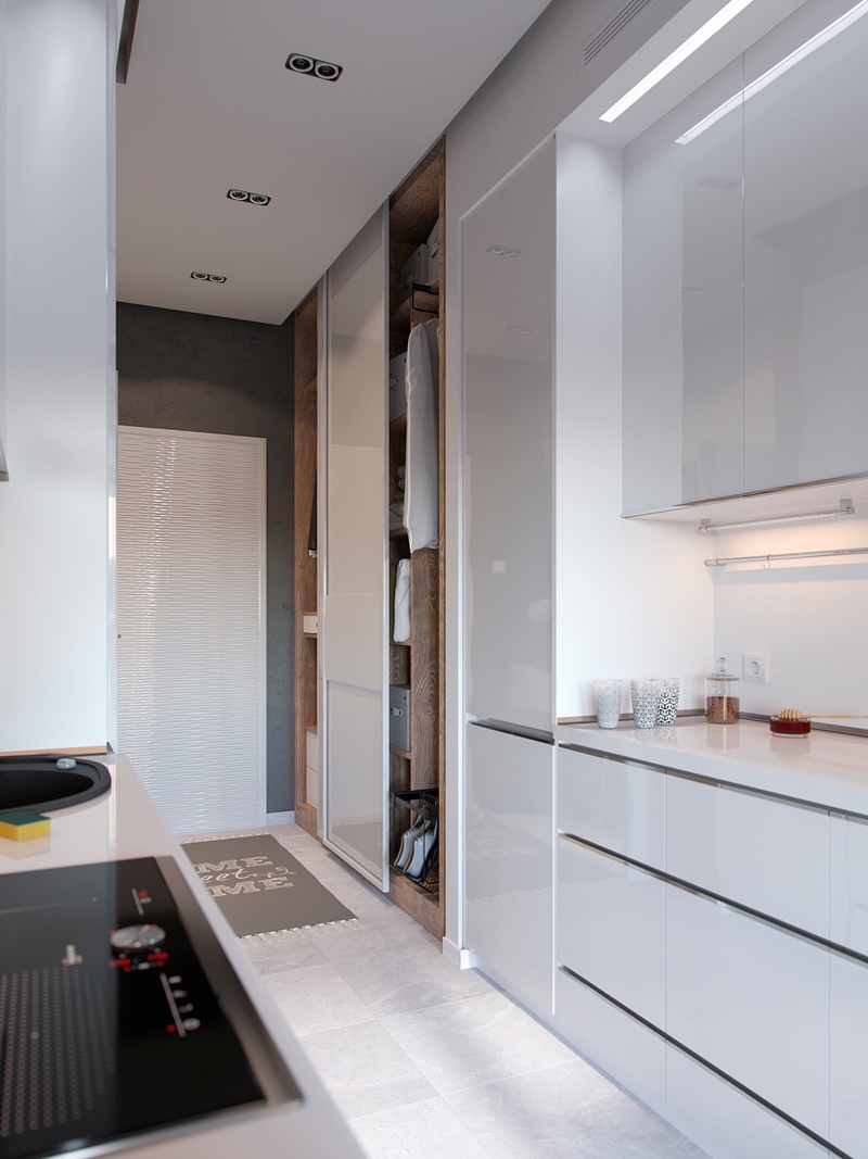 The kitchen leads directly to the entryway where a closet awaits to organize shoes and coats. The other side of the closet has a small shelf with drawers to serve as a catchall of sorts.
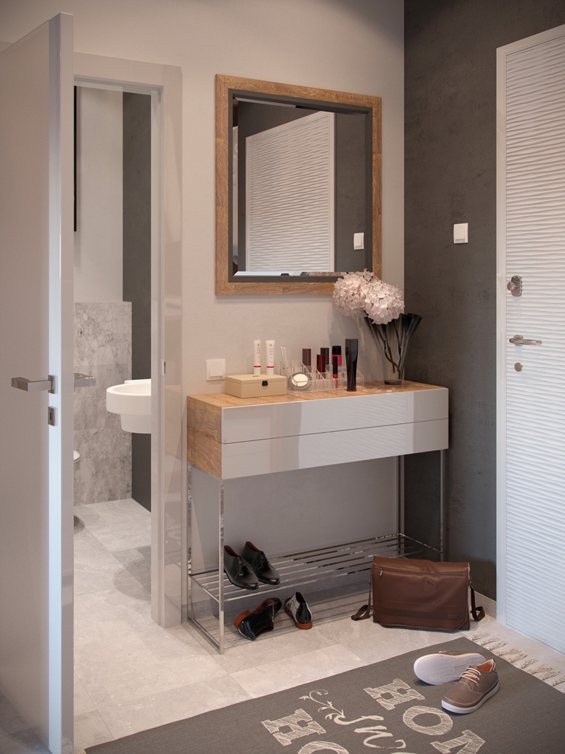 On the other side of the hallway, a little table doubles as a dressing vanity and shoe rack. This arrangement makes it easy to freshen up before heading out the door.

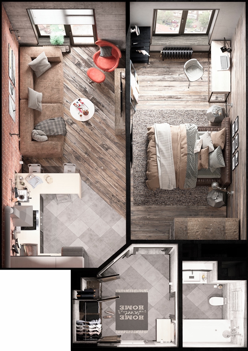
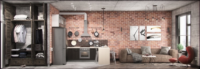 Next up is a home that blends functionality and ornament – every object serves a purpose while similarly contributing to the overall aesthetic. The result is an interior style that mixes traditional design with industrial style, establishing a huge personality despite its limited floor plan.
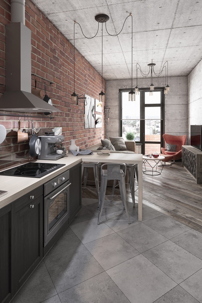 Without much space for extraneous decoration, the open living room instead relies on texture. Exposed brick and weathered wood feel rustic compared to the urban vibe of the concrete.
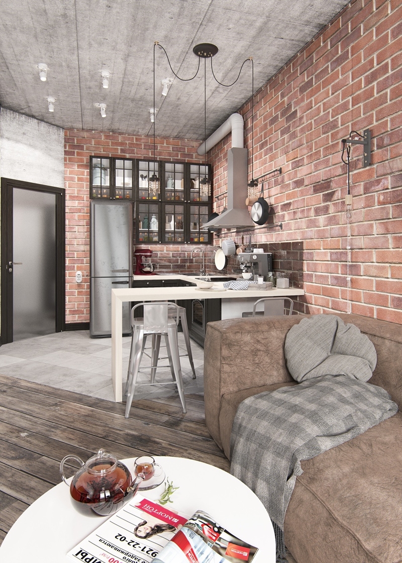 Although the general layout of the interior is very linear, it’s interesting to note how the flooring lines up with the doorway rather than the primary walls. The diagonal flow instills an irresistible sense of motion.
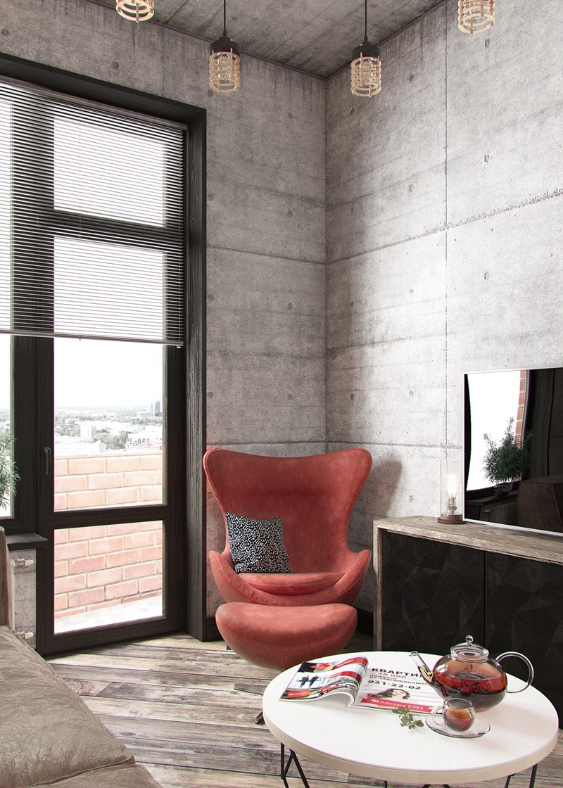 This chair is an iconic piece of late midcentury design created by Arne Jacobsen in 1958. The cage lights are a modern interpretation of a classic utilitarian style, perfect for this mixed-era home.
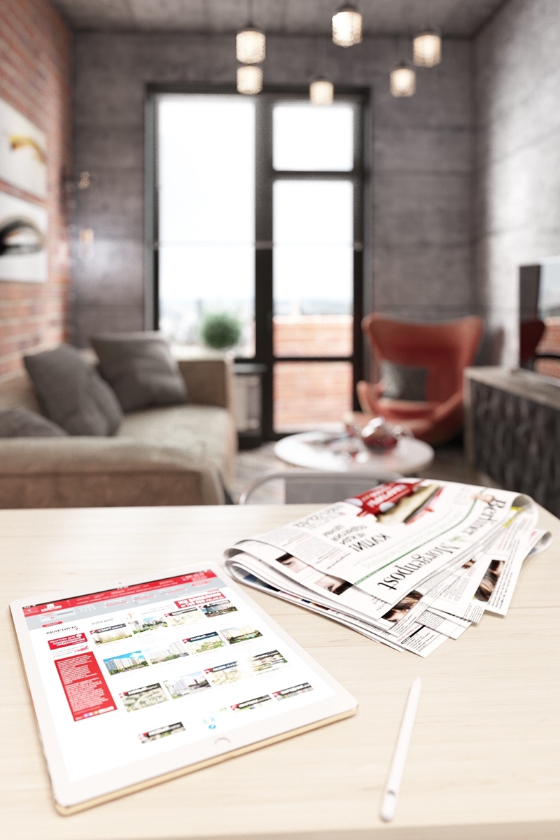 Overall, the living room feels like home. It’s adaptable and warm, purposeful and light, and uses its straightforward layout to its fullest potential.
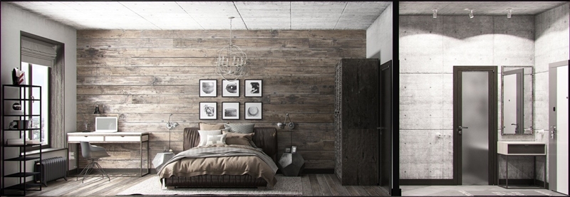 The bedroom features a bit of variation. It maintains a similar style as the living space but emphases the rustic elements over the modern. Metal features and geometric decor don’t lose sight of the home’s underlying industrial theme.
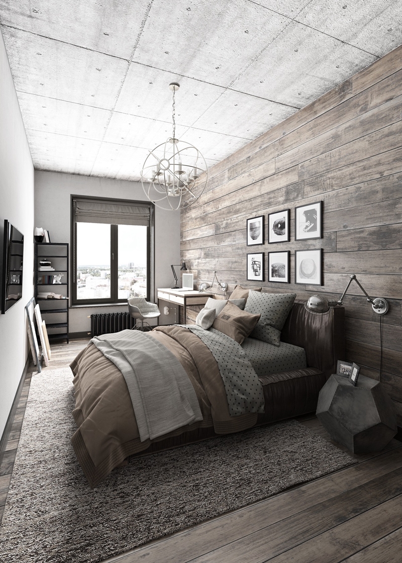 Weathered wood and leather-toned textiles give the room a touch of downhome cottage appeal. Speaking of weathered wood, it’s one of the few high-end materials that takes well to nails – perfect for an art collector that likes to rearrange often.
 These wall lamps are a wonderful example of industrial engineering converted to the design world. This style was designed by Jean-Louis Domecq to facilitate his mechanical work – the name Jieldé comes from his initials (JLD).
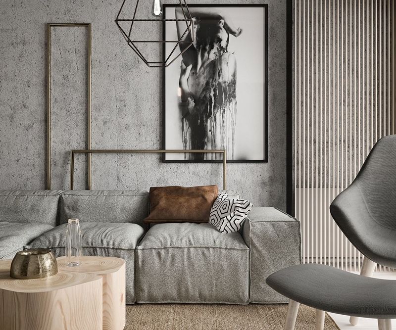 While the first home in this post used sleek modern design with a geometric twist and the second home combined rustic and industrial themes, this final apartment is the perfect combination of all four styles: modern, geometric, rustic, and industrial. The combination of materials used here are incredible, at once raw and luxurious.
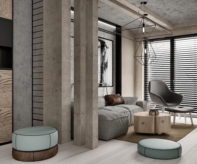 Natural wood, concrete, and neutral textiles define the living room. Geometric lighting serves as a large statement piece without feeling overwhelming.
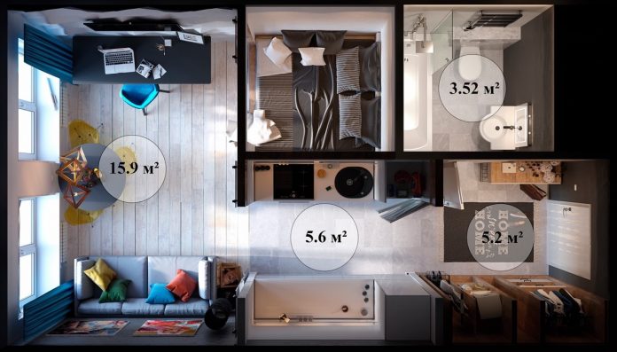
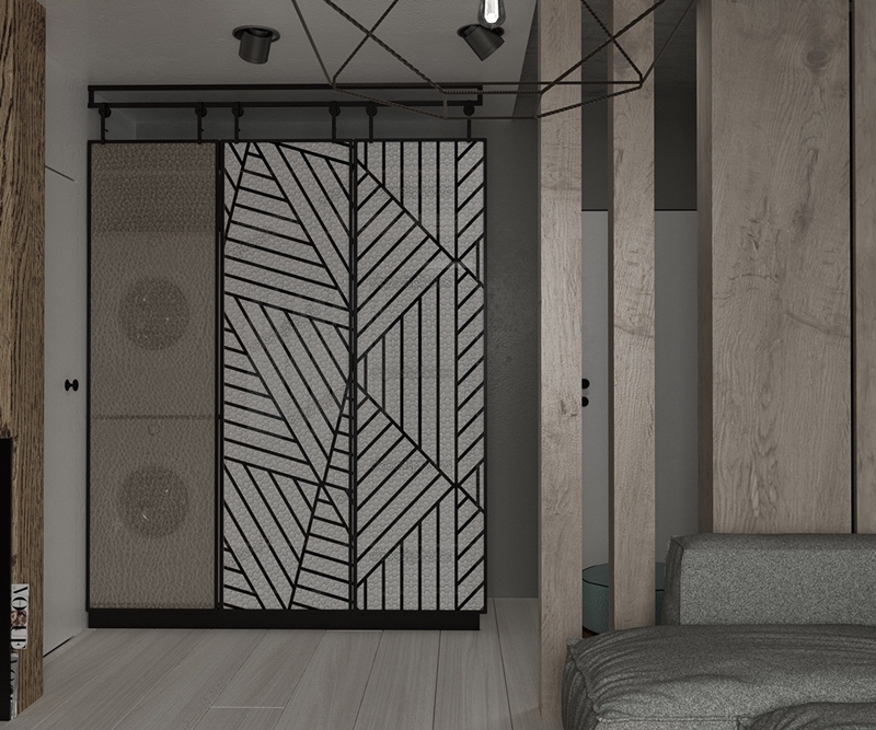 At just 33 square meters, this home contains several unique layout solutions. This cabinet makes room for laundry right in the living room – the washer and dryer are stacked behind the brown panel with a wardrobe behind the striped one.
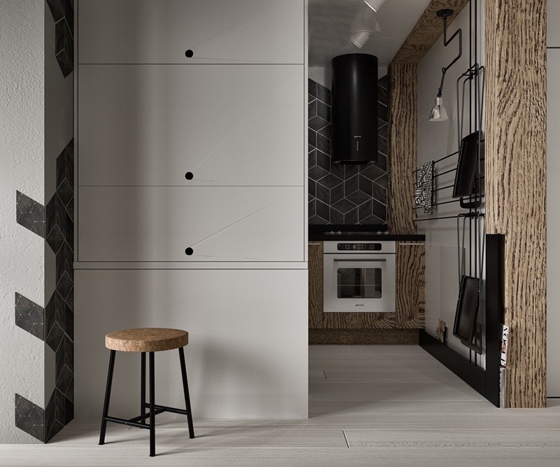 The kitchen is tucked away into a small alcove. It doesn’t have the benefit of natural light but seems to embrace its situation with dark materials.
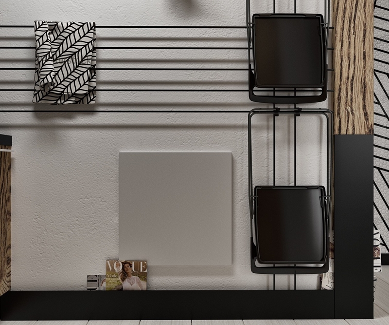 Wires span one of the kitchen walls, serving as a convenient place to hang hand towels and even extra chairs.
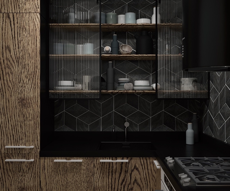 Geometric tiles like these add a real sense of depth to the backsplash.
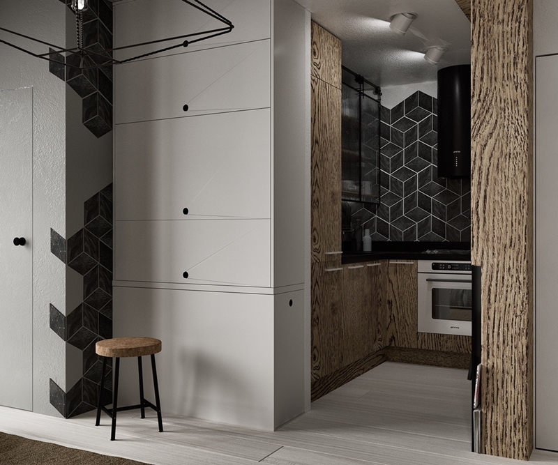 Although the kitchen has plenty of storage, there are a few more cabinets just outside.
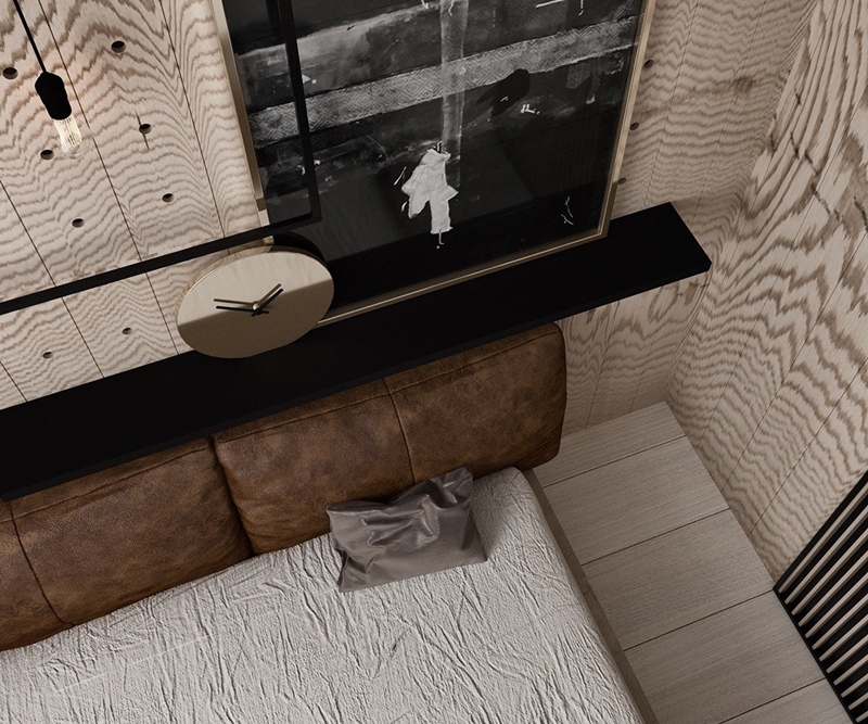
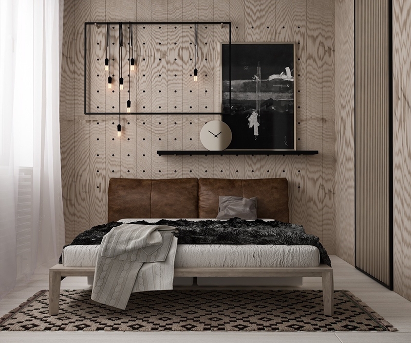 The bedroom ramps up the classic appeal with uniquely grained wood and a leather headboard. Decor remains simple for the most part, but those pendant lights and empty frame combination would make an incredible DIY project.
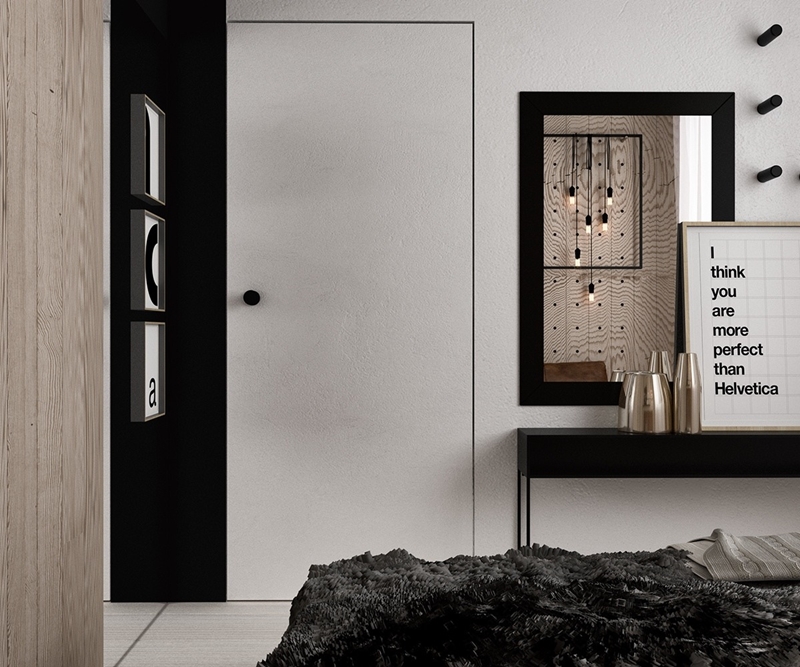 Headboard walls are a great candidate for bold design, but many designers leave the opposite side of the room simple for good reason – fewer visual distractions makes it easier to wind down before bed.
